GraphQL & React tutorial (part 2/6)
What we’re building and why we’re building it

GraphQL & React tutorial is a series of posts following the development process of an “Inbox Zero” style todo list application, built in JavaScript with the most innovative and production ready tools as of early 2017. Parts: 1, 2, 3, 4, 5, 6.
In part 2 we define the app we’re going to build and determine a set of initial requirements. Typically this part of the development process happens in collaboration with the various stakeholders in the project; perhaps a consulting firms’ client, or decision makers in a larger company. Chroma is a small product company investigating new ideas, so I’m going to explore the idea with all of you.
The problem
I lose tasks. Inevitably as you work within an organization, you will be assigned tasks in a variety of services, be it GitHub Issues, Asana, Trello, or JIRA. Keeping your eye on the tasks buried in those services is a challenge that I haven’t been able to overcome.
Like emails before I followed the Inbox Zero approach, my tasks get lost, and I end up forgetting about tasks that I didn’t want to forget about[1].
Taskbox
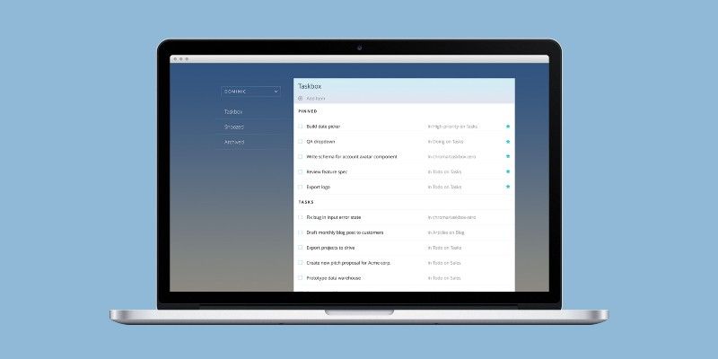
Task management fails for people when their todo list grows without bound. In 2017, it also fails when tasks are spread out across all the collaborative apps and services used by a company. I believe we can protect ourselves against todo list breakdown by combining tasks from various sources and providing a user experience that supports an “inbox zero”[2] approach to tasks.
Taskbox Zero should centralize tasks into an “taskbox” and help me quickly triage tasks into those that I need to care about today and those I do not.

Triaging tasks
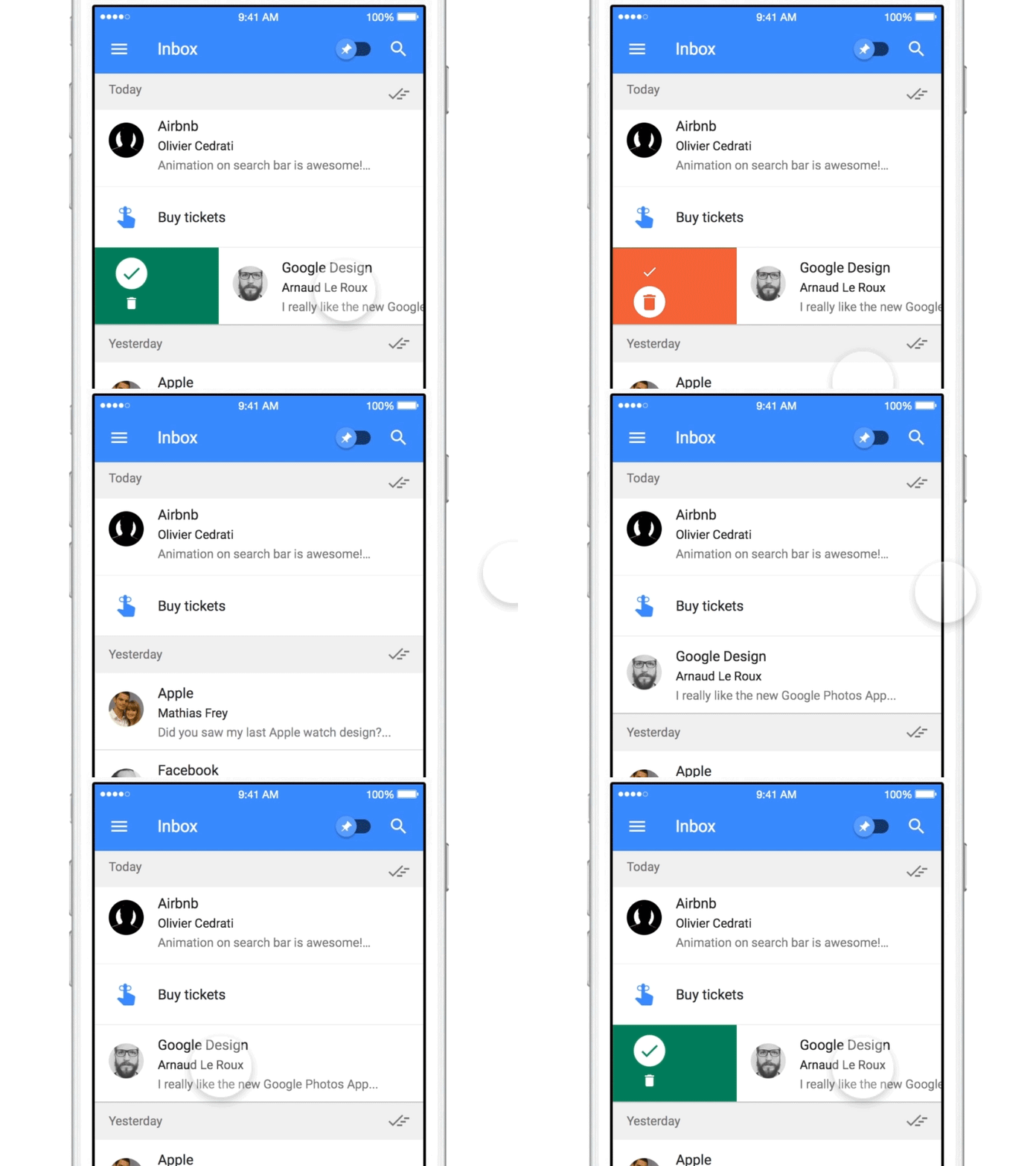
The key idea of inbox zero is to apply a triage process to your email. Act & archive emails you can take care of immediately. Archive emails that you don’t plan to action. Snooze emails you don’t want to deal with right now. When you’re done, you should have an empty inbox.
Acting on emails takes a limited amount of time. I usually deal with it in the morning before I start my day. My ideal task workflow is the same, but the nature of tasks means the “action” step is a lengthier period of time. So at the start of a day, when confronted with a list of tasks, you should be able to either:
- ✅ Act on tasks (ie. do them!), and then archive them by unassigning yourself or closing the task at source when done
- 🗄 ️Archive the task by unassigning yourself to it or deleting it at source. You aren’t ever going to do the task, for whatever reason.
- ⏰ Snooze the task to make the task reappear after a period of time, but take it out of your daily purview for now.
- 📌 Pin the task, emphasizing it in the UI. This is a short cut if you don’t want to triage all the tasks in your inbox at once.
Note that many people do not snooze emails but simply leave them in the inbox and pin the emails they intend to deal with in this session. This is essentially equivalent but we want to support both workflows.
Minimum Viable Product
What we need
We want to build the minimum product to test these ideas with users, so we’ll only specify what we absolutely need to enable the Taskbox workflow. The UI features that we need to facilitate the above are:
- Task inbox of the un-triaged tasks for today
- Snoozed tasks workflow
- Pin tasks workflow
- Archive tasks workflow
What we don’t need
We don’t need UI to complete tasks if we can provide a link to the source (i.e. GitHub or Trello) and make sure we synchronize the state changes to our database.
We also don’t need to allow you to create tasks –you can just create a “my tasks” list in Trello– it may be slightly awkward but it’ll do for now.
Finally, we won’t focus on user account UI. Although a real app would ship with multiple screens to facilitate things like resetting passwords, in this version we’ll do the absolute minimum to get a working product that we can start toying with to get a feel for the workflow.

Let’s do this!
Now we have an idea of what we are building, it’s time to start the process of getting it built. In part 3 below I’ll begin detailing the shape of the product in wireframes and really start getting into the component-driven development workflow.

[1] Forgetting about things you did want to forget about is totally fine, and in fact vitally important, given the world of information overload we inhabit.
[2] Or a “Getting Things Done” philosophy if you prefer.
[3] In a past life, my old company Percolate Studio built an open source todo list app for Meteor. We’ll save time by re-using the styling wholesale and making tweaks when necessary. Neat!